I managed to run two days in a row. My exercise schedule is all kerflooey since 16 March 2020. I’m down from five to six hours of exercise per week to much less than that now that I’m sheltered-in-place at the quarantine isolation event.
With regard to running statistics, here’s some statistics provided by Polar

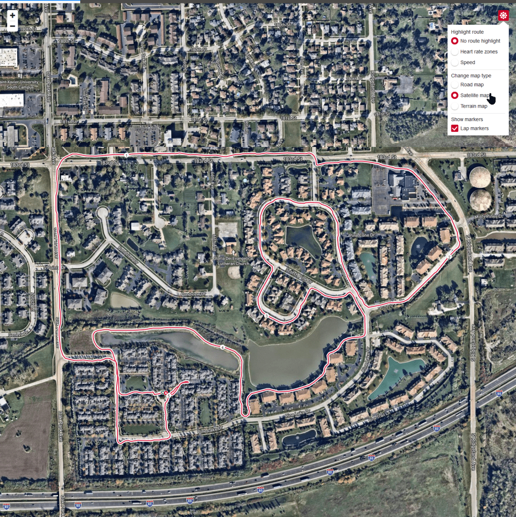
Here’s the map of the subdivision I live in as imagined by Polar dot com.
Obviously, the red portion is where I went jogging. I admit that I often catch myself using the term, running, instead of the term, jogging. This is because I used to run. Back in the 1980s I was down to a 7:40 10k. But, that was a time before kids, before I became an indoor fitness instructor, before the BodyPumps and the xTreme Psychle™. Before having a paunch the size and weight of an adult bowling ball.
Now that I run at a more modest pace, I am frequently passed up by that old lady walking her bike through the subdivision. Yes, it’s true… and it would be very funny if it was a joke. Less funny as a statement of fact. Less funny to me at least.
On the other, other hand; I find the red line on the map to be very motivating and even a tad inspirational. I know this red line technology has been around for years, but still… I’m telling you, I find it to be a tad bit inspirational. There’s something cool about seeing the results of your work. Feedback. It’s feedback.
So, that’s data point #1. The Map.
Actually, there is one more thing.
You can click the TOOLS menu button in the upper, right-hand corner. When you click the TOOLS button, the web page displays the TOOLS menu. The TOOLS menu offers lots of options of other ways to view The Map.
So. Yeah. That.
Data point #2. Also The Map.
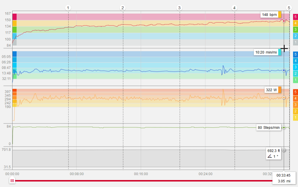
The Graphs.
There’s a graph for heart rate, a graph for pace, a graph for power in Watts, a graph for cadence in steps per minute, and a graph for altitude. Seeing as how I’m jogging in the Midwest, there’s really no need for altitude… we don’t have much altitude change around here. Still Polar is suitable for people around the globe where altitude is a thing. Not shown is a graph for temperature. I’m not sure what temperature measures because it wavered between 70°F and 80°F even though the ambient temperature was more like 60°F. The barometer was observed at 30.03 inHg.
The graph is interactive… you can click and drag the mouse pointer and the graph will tell you what your data is at that point in the session. I have absolutely no idea why there is such a heartbeat on the cadence and the power graphs about 4/5 of the way through the run. It corresponds with a hairpin turn in the course… but I agree… it’s weird and I don’t know what it means.
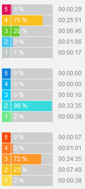
Then, there’s the Zone Charts.
The Zone charts describe your performance relative to time. The top graph is heart rate. 75% of this jogging session was performed in Zone 4. That’s pretty close to optimal for me. On the other hand, my pace per mile is Zone 2; down in the passed-by-an-old-lady-walking-her-bike zone. And my cadence of steps per minute is in Zone 3. I admit… I am not sure what this means. Apparently, Polar thinks I should be stepping a bit faster. I’ll get right on that. As soon as I start losing kilograms. Which comes first; losing kilograms or stepping it up a bit?
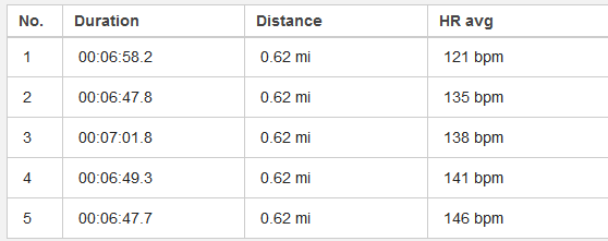
The Splits
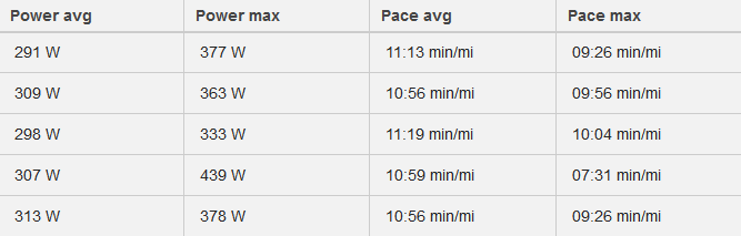
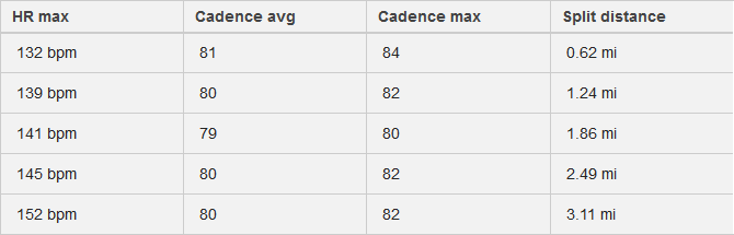
So, then we have the Splits section. By default, Polar divides your jogging or running session into kilometers. I like kilometers because a kilometer is shorter than a mile so with kilometers you have more splits than you do with miles.
So my kilometer splits range from a few seconds under 7 minutes per kilometer to a few seconds over 7 minutes per kilometer. I’m pretty consistent within 15 seconds per kilometer. Back in the 1980s I was consistent per mile to within a second or two. I attribute this change to the effects of three decades and 20 kilograms.
Likely because of the kilogram-laden paunch I’m generating between 439W and 333W. I don’t know why it fluctuates by 25% especially since my cadence remains between 79 and 84 steps per minute – which seems relatively consistent.
My average pace per mile definitely needs work. This is a flat course with very few turns. My pace should not waver by almost 30 seconds per mile. Having that data definitely gives me something to think about.
Summary

Finally, we have this summary section. Duration in hours, minutes and seconds, distance in miles, Average heart rate in beats per minutes, average power output in Watts, average pace in minutes per mile and average cadence in steps per minute. Then we have the Running Index which, according to Polar, is an approximation of V02max. A running index in the low-to-mid 40s is elite for somebody my age, gender and weight. All that means is my heart is okay despite the extra 20 kilograms. Which is not to say that I don’t want to lose 19 or 20 kilograms. I do want to lose 19 or 20 kilograms… the sooner the better.
Then there’s a Cardio load… 66 in this case, and a muscle load of 626. The cardio load shows three dots which means I worked pretty hard for a pretty long time. For comparison purposes; about 10% of the time I can get to four dots of Cardio load in a one-hour indoor cycle session. Yesterday, on the exact same run, I got four dots because 75% of the run was in the red zone… Zone 4. I don’t know why I was in the red zone yesterday and the orange zone today or why I was four dots Cardio load yesterday and only three today. It was the exact same run and today’s run was one minute faster. But, there you have it. The numbers don’t lie.
It does go to show you what a difference a day makes. Sleep, diet, and other factors such as pollen count and barometric pressure all play a huge part in determining performance.

Leave a comment